Color plays a crucial role in interior design, influencing mood, perception, and the overall ambiance of a space. When chosen thoughtfully, colors can enhance the functionality of a room, highlight architectural features, and create a harmonious environment. Conversely, poor color choices can result in a discordant and uncomfortable atmosphere. This article explores the impact of color in interior design, offering insights into how to choose the right palette for your home. We will also touch on kitchen remodeling ideas and kitchen layouts to illustrate the practical application of color theory in specific areas of the house.
The Psychology of Color
Understanding the psychological effects of color is fundamental to selecting the right palette for your home. Colors evoke emotional responses and can significantly influence the mood and energy of a space. Here are some basic psychological associations of colors:
- Red: Stimulating and energetic, red can evoke feelings of excitement and passion. It is a bold choice often used in dining rooms or kitchens to stimulate appetite and conversation.
- Blue: Calming and serene, blue is associated with tranquility and peace. It is an excellent choice for bedrooms and bathrooms where relaxation is a priority.
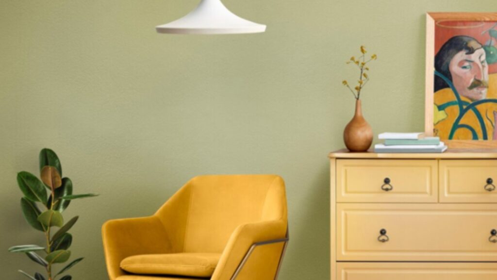
- Yellow: Cheerful and bright, yellow can create a sense of happiness and warmth. It works well in kitchens and living rooms to promote a lively and inviting atmosphere.
- Green: Symbolizing nature and renewal, green is refreshing and restful. It is ideal for almost any room, particularly spaces where you want to foster a sense of balance and calm.
- Purple: Often linked with luxury and creativity, purple can add a sense of sophistication and depth. It is suitable for bedrooms or creative spaces like studios.
- Neutral Colors (white, gray, beige): These colors provide a versatile backdrop that can complement any decor style. They are excellent for creating a sense of space and cleanliness.
Choosing the Right Palette for Each Room
When selecting a color palette for your home, consider the function and desired mood of each room. Here are some guidelines for choosing colors for different areas:
Living Room
The living room is often the central gathering place in a home. The color scheme should foster comfort and conversation. Warm colors like shades of beige, taupe, or soft yellows can create a welcoming environment. Accents of bolder colors like red or orange can be used in throw pillows, artwork, or rugs to add vibrancy without overwhelming the space.
Bedroom
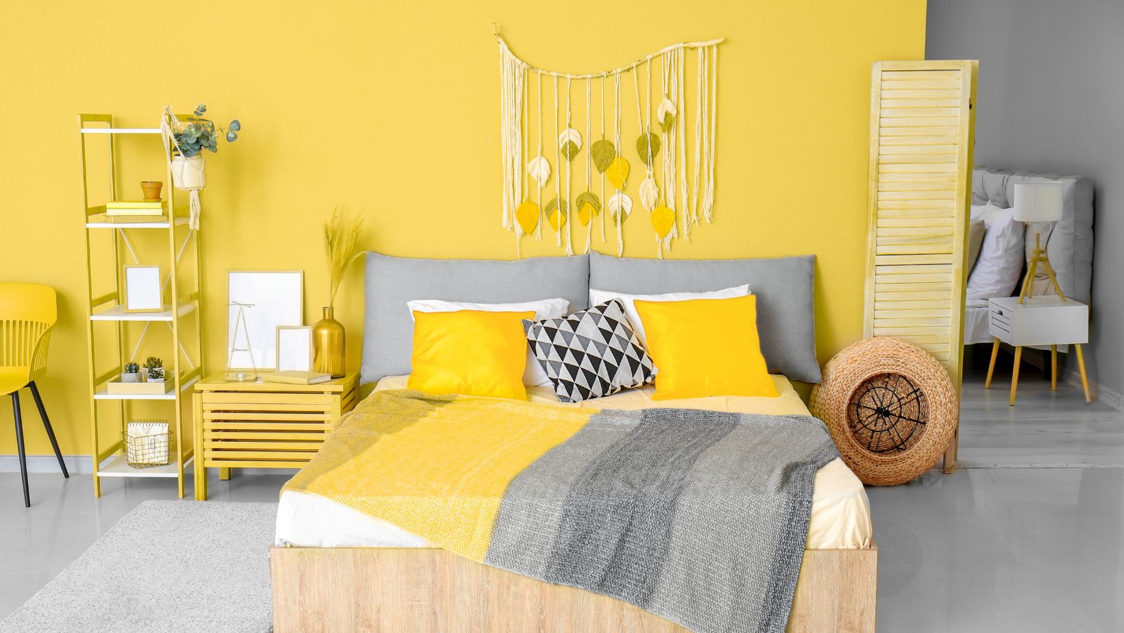
The bedroom should be a sanctuary for rest and relaxation. Cool colors like blues, greens, and purples are ideal for creating a calming atmosphere. Soft, muted tones are preferable as they help to unwind and promote better sleep. Consider using darker shades for a cozy feel or lighter shades for an airy, spacious look. A chest of drawers can also add both practical storage and a touch of style, complementing the room’s overall ambiance.
Kitchen
The kitchen is a hub of activity and often the heart of the home. Bright and cheerful colors can stimulate appetite and conversation. Whites and neutrals are popular for creating a clean and modern look while adding splashes of color through cabinetry, backsplashes, or accessories can enliven the space. For instance, a bright yellow accent wall can bring a sunny feel to the kitchen, while a deep red can add warmth and sophistication.
When considering kitchen remodeling ideas, think about how the color scheme will interact with the rest of your kitchen layouts. Open floor plans benefit from cohesive color schemes that blend seamlessly with adjoining spaces, creating a harmonious flow throughout the home.
Bathroom
Bathrooms and portable toilets are personal sanctuaries where people start and end their day. Cool colors like blues and greens work well to create a refreshing and spa-like atmosphere. Whites and light neutrals can make a small bathroom feel larger and more open. Accents of darker colors or vibrant hues can add interest and prevent the space from feeling too sterile.
The Role of Lighting
Lighting significantly impacts how colors appear in a space. Natural light changes throughout the day, affecting the perception of color. Artificial lighting, including the type (LED, incandescent, fluorescent) and color temperature (warm, cool), also influences how colors are seen. It is essential to test paint samples under different lighting conditions to ensure they achieve the desired effect.
In spaces with ample natural light, bold and dark colors can be used more freely as the light will balance out their intensity. In contrast, in dimly lit rooms, lighter colors can help to brighten the space and make it feel more inviting.
Creating Balance with Color
Achieving a balanced color scheme involves combining colors in a way that is pleasing to the eye. The 60-30-10 rule is a useful guideline for creating harmony in a room:
- 60% Dominant Color: This is the primary color used for walls, large furniture pieces, or flooring.
- 30% Secondary Color: This color complements the dominant color and is used for upholstery, curtains, or smaller furniture pieces.
- 10% Accent Color: This is the boldest color, used sparingly to add interest and contrast through accessories, artwork, or decorative items.
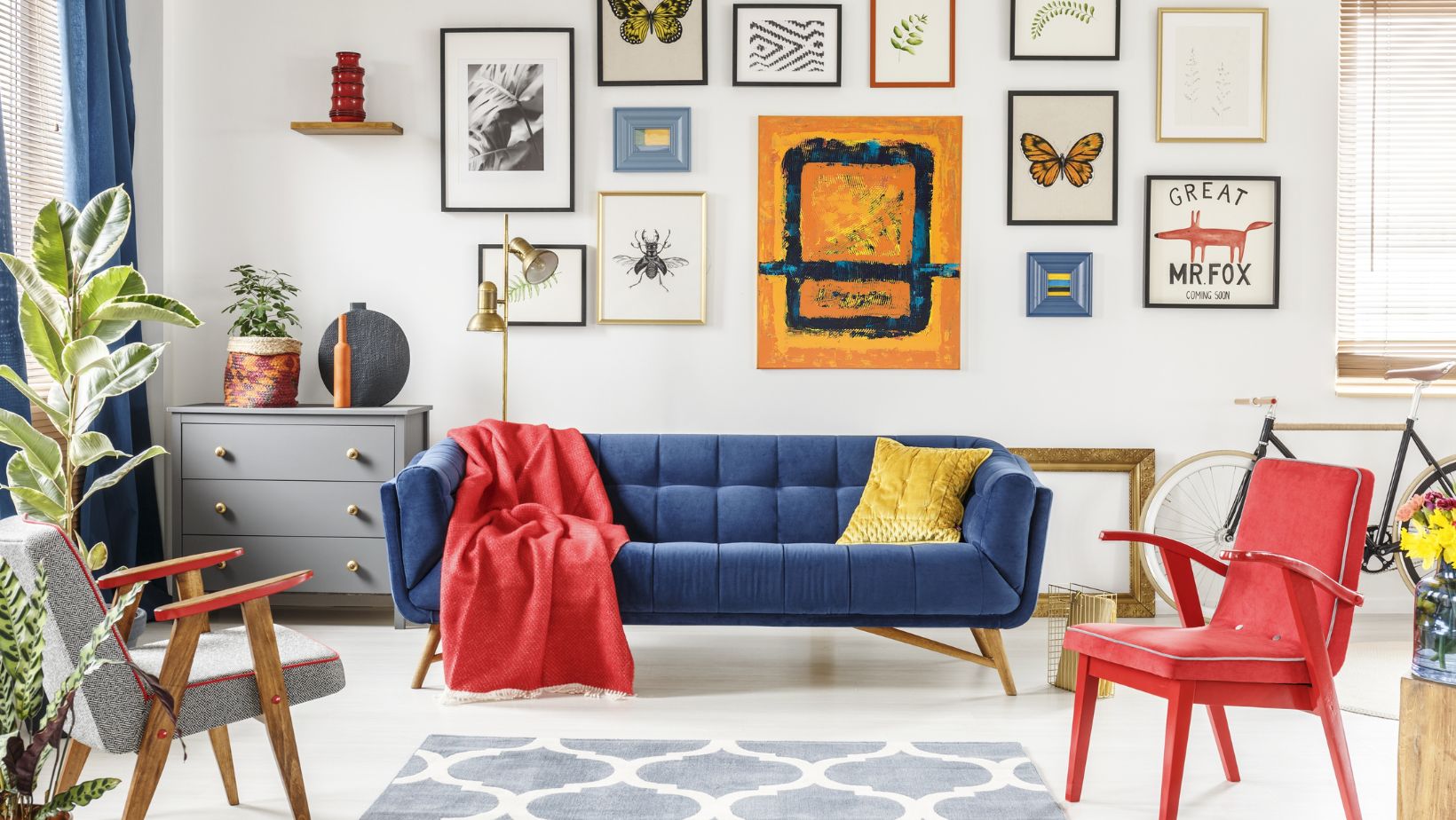
For example, in a living room with a dominant color of soft beige (60%), a secondary color of navy blue (30%) in the form of a sofa or curtains, and accents of mustard yellow (10%) in pillows or artwork can create a balanced and visually appealing space.
Trends in Color for Interior Design
Color trends in interior design evolve over time, influenced by cultural shifts, technological advancements, and global events. Staying informed about current trends can provide inspiration and help you create a contemporary and stylish home.
- Earthy Tones
Natural and earthy tones, such as terracotta, olive green, and warm browns, have become increasingly popular. These colors bring a sense of grounding and connection to nature, which is particularly appealing in our fast-paced, technology-driven world.
- Bold and Saturated Colors
Bold, saturated colors like deep teal, emerald green, and rich burgundy are making a statement in modern interiors. These colors add depth and drama, creating a luxurious and sophisticated ambiance.
- Pastel Shades
Soft pastel shades, including blush pink, mint green, and light lavender, are perfect for creating a serene and delicate atmosphere. These colors are often used in bedrooms and bathrooms to evoke a sense of calm and relaxation.
- Monochromatic Schemes
Monochromatic color schemes, where varying shades of a single color are used throughout a space, are gaining popularity. This approach creates a cohesive and elegant look, making rooms feel more expansive and harmonious.
Practical Application: Kitchen Remodeling Ideas
When considering kitchen remodeling ideas, color plays a pivotal role in transforming the space. Here are some practical tips for incorporating color into your kitchen remodel:
Cabinetry
Updating kitchen cabinetry with a fresh coat of paint can dramatically change the look of the space. Consider using two-tone cabinets, with a darker color on the lower cabinets and a lighter shade on the upper ones, to add visual interest and balance. Additionally, updating or adding a drawer can enhance both the functionality and aesthetics of your kitchen. Drawers provide convenient storage solutions and can be customized to match or complement the cabinet design, creating a cohesive and stylish look throughout your kitchen.
Backsplash
A colorful backsplash can serve as a focal point in the kitchen. Choose tiles in vibrant hues or interesting patterns to add personality and style. Glass, ceramic, or even metal backsplashes can reflect light and create a stunning visual effect.
Countertops
Countertops in bold colors or unique materials can add a touch of luxury and sophistication. Quartz, granite, and marble come in a variety of colors and patterns, allowing for a personalized and stylish kitchen design.
Appliances and Fixtures
Incorporating color through appliances and fixtures is another way to enhance your kitchen. Bold-colored appliances, like a red oven or a blue refrigerator, can make a statement, while colored fixtures, such as faucets and cabinet handles, can add subtle pops of color.
Kitchen Layouts and Color
The layout of your kitchen significantly influences how colors are perceived and used. Here are some considerations for integrating color into different kitchen layouts:
Galley Kitchen
In a galley kitchen, where space is limited, using light and neutral colors can make the area feel larger and more open. Bright accent colors can be used sparingly in backsplashes, rugs, or small appliances to add interest without overwhelming the space.
L-Shaped Kitchen
L-shaped kitchens offer more flexibility in color choices. Consider using a dominant color for the main cabinets and a contrasting color for the island or peninsula to create a dynamic and visually appealing layout.
U-Shaped Kitchen
In U-shaped kitchens, balance is key. Use a consistent color scheme throughout the cabinetry and countertops to create a cohesive look. Bold colors can be introduced through backsplashes, wall paint, or accessories to add depth and interest.
Conclusion
Choosing the right color palette for your home is an essential aspect of interior design that can significantly impact the overall ambiance and functionality of each space. By understanding the psychological effects of colors and considering the specific needs of each room, you can create a harmonious and inviting home environment.
Whether you’re exploring kitchen remodeling ideas or planning a full home makeover, thoughtful color choices will enhance the beauty and comfort of your living spaces. Remember to consider the role of lighting, create balance with color combinations, and stay informed about current trends to achieve a stylish and timeless design.