For the coding novice, getting it right is no easy task. Here’s where visual design tools come in. Designed for authors at any level, these tools allow anyone to create an appealing, functioning web site that runs smoothly across multiple devices.
This blog post will explore how visual design tools simplify the process of creating responsive websites, the benefits they offer, and key features to look for when selecting a tool for your projects.
The Importance of Responsive Web Design
Responsive web design ensures that websites are accessible and provide a seamless user experience, regardless of the device being used. Whether it’s a smartphone, tablet, or desktop, a responsive site adjusts its layout, images, and functionalities to deliver optimal performance. As mobile browsing continues to grow, having a responsive website is no longer optional—it’s a requirement for businesses and individuals looking to engage users effectively.
Without responsive design, users may encounter issues such as text that is too small to read, images that don’t scale properly, or buttons that are difficult to click on mobile devices. These issues lead to poor user experience, higher bounce rates, and ultimately, lost opportunities. Visual design tools make it easy to avoid these pitfalls by offering drag-and-drop functionality and pre-built templates that automatically adjust to different screen sizes.
How Visual Design Tools Simplify Web Development
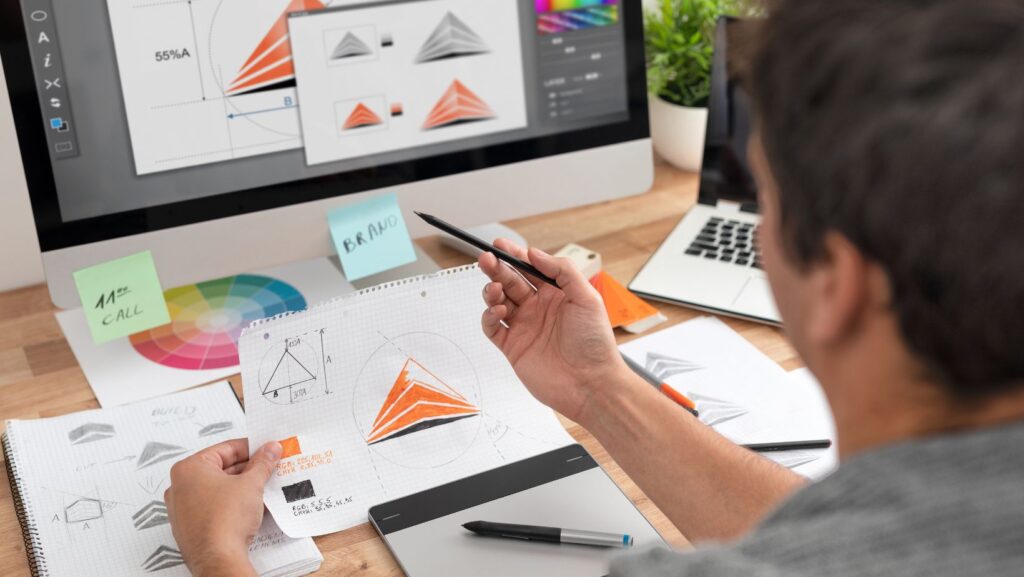
Visual design tools have made it significantly easier for users to create websites without needing extensive coding knowledge. These platforms allow both beginners and experienced designers to focus on the creative aspects of web development rather than the technical ones. With intuitive interfaces and robust features, visual design tools streamline the process in several ways:
Drag-and-drop functionality: One of the key features of visual design tools is the drag-and-drop interface, allowing users to move elements around a webpage easily. This eliminates the need to write complex lines of code, making it accessible for non-developers to build websites efficiently.
Responsive design integration: Modern visual tools ensure that every element on the site adjusts automatically to different screen sizes, from desktops to mobile devices. This built-in responsiveness reduces the time spent testing and optimizing for various devices, delivering a smooth experience across platforms.
Pre-built templates: These tools often come with a variety of professionally designed templates. Whether it’s for a corporate website or a creative portfolio, templates provide a head start, enabling users to choose layouts that can be easily customized according to their needs.
Real-time previews: Being able to see design changes in real time provides a more efficient workflow. This allows designers to make adjustments on the fly, ensuring that the final result meets their vision without repeated testing or coding tweaks.
Visual tools also make transitioning platforms more seamless. For instance, businesses undergoing a migration to Webflow can benefit from these features, as the platform offers powerful design capabilities without requiring extensive coding knowledge, ensuring a smooth migration process.
Benefits of Using Visual Design Tools
There are several key benefits to using visual design tools for building responsive websites. First and foremost, they offer accessibility. Even without a deep understanding of HTML, CSS, or JavaScript, users can still create functional, professional-looking websites. This democratization of web design allows businesses, entrepreneurs, and creatives to take control of their online presence without hiring expensive developers.
Secondly, visual design tools save time. By leveraging pre-made components and templates, designers can quickly assemble a website that looks polished and professional. Many visual design platforms come with pre-built layouts optimized for responsiveness, allowing users to skip the repetitive task of creating different layouts for each device manually.
Lastly, visual design tools empower creativity. Traditional coding can sometimes limit a designer’s vision, as translating complex designs into code can be a challenge. Visual design tools, however, allow for experimentation and immediate feedback. Designers can tweak and adjust their creations freely, experimenting with different layouts, fonts, and color schemes to see what works best—all in a matter of clicks.
Key Features to Look for in Visual Design Tools
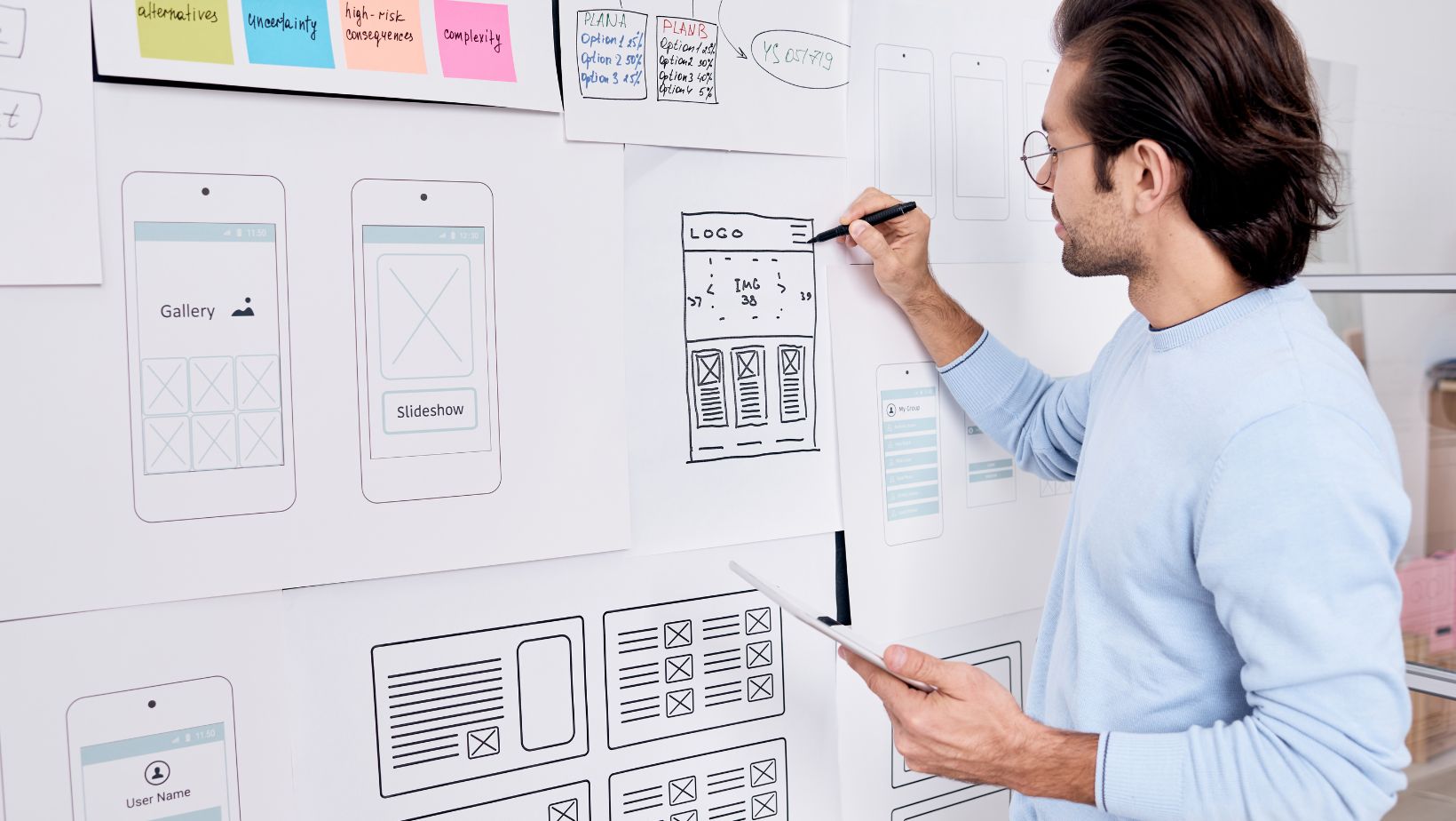
When selecting a visual design tool, it’s essential to consider several key features that will help you create responsive websites efficiently. One of the most important features is drag-and-drop functionality. This allows you to easily position elements on the page, providing flexibility and eliminating the need for coding.
Another critical feature is pre-built templates. High-quality templates serve as a foundation for your design, ensuring your website is responsive from the start. Look for platforms that offer a wide range of customizable templates, tailored for various industries and use cases.
You should also ensure the tool provides device previews, allowing you to test how your website will look on different screen sizes. This real-time feedback is crucial for ensuring that your site delivers an optimal experience across all devices.
Finally, integrations with third-party tools like e-commerce platforms, marketing tools, and analytics are important if you want to add extra functionality to your website. Many visual design platforms offer integrations that allow you to expand your website’s capabilities without requiring custom coding.
Streamlining the Workflow for Professional Designers
While visual design tools are often marketed as user-friendly options for beginners, they also serve as powerful platforms for professional designers. The combination of flexibility, drag-and-drop features, and custom coding options makes these tools an excellent choice for professionals seeking a faster workflow.
For professional designers working with clients, the ability to rapidly prototype websites and share them for feedback is invaluable. Many visual design tools offer collaboration features that allow designers to present multiple design versions, gather input, and implement changes in real time. This accelerates the entire design process and helps ensure that clients are satisfied with the final product.
Moreover, these tools are ideal for teams that work across various departments, such as marketing and development. Because they streamline communication and collaboration, visual design tools reduce the bottlenecks often associated with web development, allowing teams to bring websites to life more efficiently.
The Evolution of Visual Design in Web Development
The future of web development is undoubtedly shifting towards more intuitive and accessible tools. As businesses and individuals look for ways to create responsive websites without the technical barriers, visual design tools will continue to play a crucial role in democratizing the web design process. With the rise of artificial intelligence (AI) and machine learning, we can expect even more intelligent features that automate design decisions, further simplifying the creation of responsive websites.

For instance, AI-powered design assistants could offer suggestions on improving layouts for mobile responsiveness or recommend color palettes based on user preferences and industry standards. This type of integration will make it even easier for users to create high-quality websites that cater to their audiences across different devices.
Conclusion
Visual design tools have revolutionized the way we create responsive websites, making the process easier, faster, and more accessible. Whether you’re a business owner, an entrepreneur, or a professional designer, these tools offer powerful features that eliminate the need for coding, streamline the design process, and ensure that your website functions flawlessly across all devices.
As mobile usage continues to grow, having a responsive website is no longer a luxury but a necessity. By embracing visual design tools, you can ensure that your website is equipped to provide the best possible user experience, no matter the device your visitors are using. With the right tool in hand, creating a visually stunning, fully responsive website has never been easier.