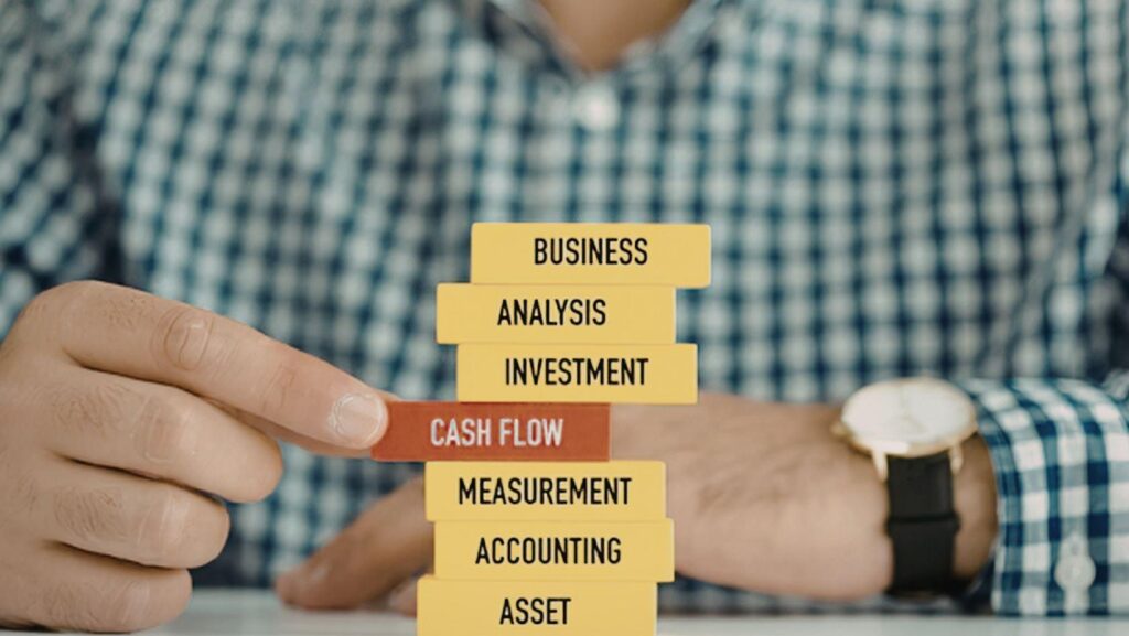
Every serious investor understands the concept of an asset that compounds over time.
You make the investment once. You deploy it correctly. And it continues generating returns — month after month, year after year — long after the initial cost is forgotten.
Your business logo is exactly that kind of asset.
It appears on every customer touchpoint: your website, your social media profiles, your invoices, your email signature, your packaging, your advertising, your pitch deck. Every time a potential client, investor, or partner encounters your brand, your logo is doing work — building recognition, communicating credibility, and compressing the trust-building timeline from months into seconds.
The question is not whether your business needs a professional logo. Every serious business does. The question is whether you are building that asset intelligently — or leaving value on the table with a weak visual identity that undermines everything else your business does well.
In 2026, building a professional logo requires neither a large budget nor an agency retainer. A free AI logo generator like the one built into Adobe Express gives any entrepreneur, investor, or business operator the tools to create a polished, professional brand mark in under 30 minutes — at zero cost, with no design experience required.
Here is the business case for doing it right, and exactly how to execute it.
The ROI Case for a Professional Logo
Before getting into execution, it is worth establishing the business case clearly — because most entrepreneurs treat logo design as a creative expense rather than a strategic investment.
That framing is a mistake.
Brand recognition reduces customer acquisition cost. It takes an average of 5 to 7 brand impressions before a prospect takes a meaningful action. A distinctive, consistently applied logo accelerates that recognition cycle. Faster recognition means faster trust. Faster trust means lower CAC and shorter sales cycles — measurable improvements in your unit economics.
Visual credibility increases conversion rates. Stanford research on web credibility established that design quality is among the top factors consumers use to evaluate the trustworthiness of a business. A professional logo on your website, your proposals, and your digital presence reduces the credibility friction that causes prospects to hesitate or look for an alternative. In competitive markets, that friction is often the margin between winning and losing a deal.
Brand equity compounds over time. Unlike paid advertising — which stops generating returns the moment you stop spending — a well-deployed logo builds equity with every impression. The recognition that your logo generates in Year 1 adds to Year 2’s baseline. This compounding effect is why the world’s most valuable brands are worth multiples of their physical assets: brand equity is real, measurable, and defensible.
Investor and partner perception. If you are raising capital, seeking partnerships, or approaching enterprise clients, your brand presentation signals the operational maturity of your business. A polished logo on your pitch deck, your executive summary, and your website communicates that you run a professionally managed operation — which reduces perceived risk for everyone on the other side of the table.
Who Needs to Read This
RedAndWhiteMagz covers a sophisticated audience of business operators, investors, and finance professionals. Here is how a professional logo applies across the range of businesses and ventures that audience runs:
Startups and Growth-Stage Businesses: Early-stage companies often deprioritize branding in favour of product development and customer acquisition. This is a strategic error. A professional logo from Day 1 sets a credibility baseline that affects every subsequent interaction — with customers, investors, and partners. The cost of retrofitting a brand after growth is far higher than building it correctly at the start.
Independent Consultants and Advisors: In professional services — financial advisory, management consulting, legal services, executive coaching — your brand is your reputation made visible. A professional logo on your proposal documents, your website, your LinkedIn profile, and your client-facing materials signals the level of seriousness that commands premium rates.
E-commerce and DTC Brands: In direct-to-consumer commerce, the logo on your packaging, your website, and your social channels is the first brand signal customers receive. Research consistently shows that branded packaging commands higher perceived value — which translates directly into pricing power and repeat purchase rates.
Crypto and Web3 Projects: The crypto and NFT space is filled with projects competing for attention and credibility. A professional logo and visual identity is one of the fastest signals of legitimacy in a market where the gap between credible projects and scams is often evaluated visually before any technical due diligence begins.
Real Estate Investors and Agents: Personal brand is one of the highest-leverage investments a real estate professional can make. A logo on your listings, your social profiles, your email signature, and your business cards builds the local recognition that drives the referrals and repeat business that sustain long-term income.
Content Creators and Media Brands: Newsletters, podcasts, YouTube channels, and financial education platforms are businesses. A professional logo on your content, your channel art, and your email header signals an editorial operation worth subscribing to — and positions you for the brand partnerships and sponsorship deals that monetize that audience.
Step-by-Step: Build Your Business Logo with Adobe Express AI
Step 1: Start with Brand Strategy
The most common mistake entrepreneurs make with logo design is treating it as a design problem rather than a strategy problem. Before you open any tool, define your strategic brief.
Answer these four questions:
1. What is your market position? Premium and exclusive? Accessible and value-oriented? Technical and specialist? Disruptive and innovative? Your logo should visually reinforce your positioning — not contradict it.
2. Who is your primary audience? B2B decision-makers in enterprise? High-net-worth individual investors? SMB owners? Digital consumers? Each audience reads visual signals differently. Your logo needs to speak the visual language your target audience already trusts.
3. What is the primary emotion your brand should trigger? Trust and reliability? Innovation and progress? Exclusivity and aspiration? Approachability and warmth? Every design decision should serve this emotional objective.
4. What is your competitive differentiation? Do a 60-second visual audit of your direct competitors’ logos. Identify the dominant conventions in your space — colour palettes, icon styles, typography choices. Then decide: do you want to signal category membership (similar aesthetic signals) or category disruption (deliberately different)?
These four answers are your creative brief. Execute against them.
Step 2: Write a Strategic Prompt
Head to the free AI logo generator from Adobe Express and translate your brief into a description. Here are ready-to-use prompts across business sectors RedAndWhiteMagz covers:
Financial Advisory and Wealth Management: “Premium financial advisory logo, shield and upward arrow icon, deep navy and warm gold, strong classic serif font, authoritative and trustworthy”
Business Consulting Firm: “Professional consulting firm logo, geometric compass and growth chart icon, dark charcoal and electric blue, bold clean sans-serif, strategic and credible”
Startup and Tech Venture: “Modern tech startup logo, abstract node network icon, electric blue and white, clean geometric sans-serif font, innovative and forward-thinking”
Crypto and Web3 Project: “Sharp crypto project logo, hexagon and chain link icon, dark navy and electric gold, bold modern sans-serif font, secure and cutting-edge”
E-commerce and DTC Brand: “Clean e-commerce brand logo, abstract geometric mark, deep teal and warm coral, modern bold sans-serif font, trustworthy and approachable”
Real Estate Investment Brand: “Professional real estate investment logo, building silhouette and upward arrow, dark navy and gold, strong clean serif font, established and reliable”
Private Equity or Investment Fund: “Prestigious investment fund logo, eagle and shield crest icon, black and warm gold, refined classic serif font, exclusive and powerful”
Digital Media and Newsletter Brand: “Sharp digital media brand logo, pen nib and lightning bolt icon, deep charcoal and bright red, bold modern sans-serif, authoritative and dynamic”
SaaS Business Platform: “Clean SaaS platform logo, abstract gear and cloud icon, steel blue and white, modern geometric sans-serif, scalable and reliable”
Executive Coaching and Leadership Brand: “Empowering leadership brand logo, torch and upward star icon, deep navy and warm gold, strong serif font, authoritative and inspiring”
Generate multiple iterations — the same way you model multiple scenarios before committing to a financial decision. Each generation is free. The best output often emerges after several rounds of refinement.
Step 3: Apply Brand Psychology to Your Evaluation
Once the AI generates options, evaluate them through a strategic lens rather than purely aesthetic preference. Here is how brand psychology maps to design decisions:
Colour Psychology for Business Brands:
|
Colour |
Strategic Signal |
Best Application |
|
Deep Navy |
Authority, trust, stability |
Financial services, legal, B2B enterprise |
|
Black |
Premium, sophistication, power |
Luxury brands, high-ticket consulting, private equity |
|
Warm Gold |
Excellence, prestige, success |
Investment brands, advisory firms, premium services |
|
Electric Blue |
Innovation, technology, precision |
Tech ventures, SaaS, digital platforms |
|
Deep Green |
Growth, prosperity, reliability |
Financial planning, sustainable business, investment |
|
Charcoal |
Professionalism, neutrality |
Consulting, media brands, analytical services |
|
Red |
Energy, urgency, confidence |
Performance brands, disruptive startups, bold agencies |
|
White / Minimal |
Clarity, cleanliness, modern |
Clean tech, minimalist brands, digital-first businesses |
Shape Psychology: Circular marks communicate community and inclusivity. Geometric and angular marks signal precision and forward motion. Shield and crest forms communicate protection and heritage. Abstract marks signal modernity and scalability — they work well for brands that want to avoid being too category-specific.
Typography: Heavy sans-serif fonts project energy and confidence — appropriate for growth-stage businesses and digital brands. Classic serif fonts project authority and longevity — appropriate for financial services, advisory, and established operations. Geometric sans-serifs project technical precision — appropriate for SaaS, fintech, and data-driven brands.
Step 4: Build a Brand System, Not Just a Logo
Open your chosen design in the Adobe Express editor and build it into a deployable brand system:
- Lock in HEX codes — the exact colours you will use across every digital and print application
- Document font choices — apply them consistently across your website, presentations, and communications
- Create multiple layout versions — horizontal lockup for letterheads and website headers, stacked for social profiles, icon-only for favicons and profile pictures
- Build a reversed version — white logo elements on transparent background for dark contexts, presentations, and digital advertising
- Add a positioning tagline if your brand benefits from one — “Strategic Financial Intelligence,” “Growth Capital Solutions,” “Data-Driven Business Advisory”
A brand system that is documented and consistently applied is worth significantly more than a logo used inconsistently across different contexts.
Step 5: Deploy Across Every Business Touchpoint
Download as a PNG with transparent background and integrate it across every point where your business makes an impression:
- Website header, footer, and favicon
- LinkedIn company page and personal profile banner
- All social media profiles — Twitter/X, Instagram, Facebook
- Email signature — standardised across your entire team
- Pitch deck and investor presentation cover
- Business proposal and quotation templates
- Invoice and contract header
- Google Business and review platform profiles
- Podcast cover art and YouTube channel art
- Newsletter header for subscriber communications
- Trade show and event display materials
- Business card design
Every touchpoint where your logo appears is a compounding brand impression. Consistency across all of them is what builds the recognition and trust that shortens sales cycles and improves conversion rates.
The Business Case for Getting This Right — Now
In competitive markets, the businesses that build strong brands early create durable advantages that are difficult for later entrants to replicate. Brand recognition is not easily purchased — it is accumulated through consistent, professional presence over time.