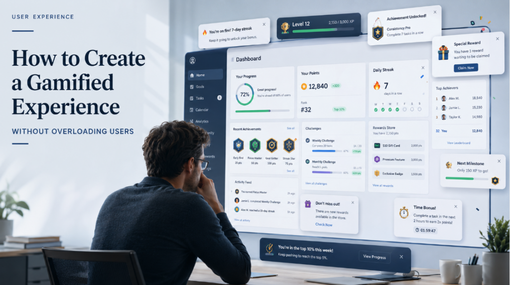
A user opens an app to do one simple thing. Finish a lesson. Track a workout. Complete onboarding. Check a bank balance. Then the screen lights up with coins, badges, streak warnings, pop-ups, progress animations, reward points, and a cheerful message calling them a “champion.” They came to get something done. Now they have to figure out why the product is throwing a party.
That is where gamification starts to go wrong. It is supposed to make an experience easier to follow, more motivating, or more satisfying. It should help users notice progress, keep momentum, and understand what to do next. When it becomes louder than the actual task, it stops being engagement design. It becomes clutter with a scoreboard attached.
Gamification is not automatically bad. It is also not automatically clever. At its simplest, it means using game-like mechanics in a non-game product: points, levels, badges, streaks, challenges, progress bars, checklists, rewards, quests, leaderboards, and completion states. A progress bar can reduce anxiety. A badge can mark a real achievement. A streak can help someone build a habit. But the same tools can also feel fake, childish, or manipulative when they are dropped into the wrong place.
The problem usually starts with good intentions. A team wants better retention, higher completion rates, more daily use, or fewer abandoned sign-ups. So they add points. Then badges. Then streaks. Then a leaderboard. Then a reward currency nobody understands. But game mechanics are not a substitute for product value. If the core experience is weak, gamification will not hide it. In many cases, it makes the weakness more obvious.
Good gamification starts with a boring but useful question: what is the user actually trying to do?
A language learner may need small wins because the process is long and repetitive. A fitness app may need visible progress because motivation disappears quickly when results are slow. A project management tool may need checklists because users want clarity, not excitement. A tax, banking, or healthcare app probably does not need cartoon coins. The mechanic has to match the emotional weight of the task.
This is especially true in comparison-heavy industries, where users already have enough information to process. A platform like HEX Česko does not need playful rewards to feel useful; its value comes from clear structure, direct comparisons, and helping readers understand their options without extra noise.
The safest mechanics are often the quiet ones. They do not scream for attention. They reduce uncertainty.
Useful light-touch mechanics include:
- progress bars that show how much is left;
- checklists that make a process feel manageable;
- milestone labels that mark meaningful progress;
- “next step” prompts that remove guesswork;
- completion percentages that help users understand where they stand;
- personal progress summaries that show improvement over time.
These work because they answer questions users already have: How far am I? What happens next? Did I do this correctly? Is this worth finishing?
That is the real job of gamification. Not decoration. Feedback.
A fitness ring works because it turns invisible effort into something visible. An onboarding progress bar works because it tells the user the process will not last forever. A course checklist works because it gives structure to something that could otherwise feel open-ended. None of these mechanics needs to shout. They work because they make the user feel oriented.
The same logic applies to review and affiliate platforms such as CasinoHEX SK, where clarity matters more than entertainment. If users are comparing bonuses, payment methods, or licensing details, the interface should guide them quietly instead of turning the page into a game.
Rewards should feel earned. A badge for finishing a hard module makes sense. A badge for opening the app twice feels pointless. Points only work when they show real progress, unlock something useful, or help users understand their improvement.
This matters because users stay engaged when they feel progress and control. If rewards start replacing real value, the product feels cheap. People should not feel like they are being bribed to use bad design.
You can usually spot overloaded gamification fast. It looks like:
- too many reward systems at once;
- pop-ups after every small action;
- badges for things nobody cares about;
- streaks that create guilt instead of motivation;
- leaderboards added to products where comparison feels awkward;
- animations that delay the task;
- reward currencies with unclear value;
- notifications that sound needy;
- playful language in a serious context;
- fake urgency dressed up as a challenge.
The issue is not only taste. It is cognitive load. Every added mechanic asks the user to understand another rule. What are coins for? Can I lose my level? Why did I earn XP? What does this badge do? Should I care about this streak? Is this ranking public? When users have to decode the reward system before they can use the product, the design has become the problem.
A lot of bad gamification comes from treating all engagement as good engagement. It is not. A user tapping around because they are confused is not engaged. A user returning because they are anxious about losing a streak is not necessarily loyal. A user chasing points without understanding the product’s value is not deeply motivated. Metrics can make this look successful for a while, but users eventually notice when the experience feels hollow.
The most common mistakes are painfully predictable.
First, teams add points with no purpose. If points do not unlock anything, measure anything useful, or reflect real progress, they become decorative noise.
Second, they use childish copy in adult situations. “Great job, superstar!” might work in a kids’ learning app. It sounds strange in accounting software.
Third, they reward every tiny action. When everything is an achievement, nothing feels like one.
Fourth, they force competition where users want privacy. Not every product needs a leaderboard. In health, finance, education, and workplace tools, public comparison can easily make people feel exposed or behind.
Fifth, they punish broken streaks too harshly. A streak should support habit formation. It should not make someone feel like one missed day destroyed months of effort.
Sixth, they add animations that interrupt completion. A small celebration can feel good. A five-second animation every time someone completes a basic task gets old fast.
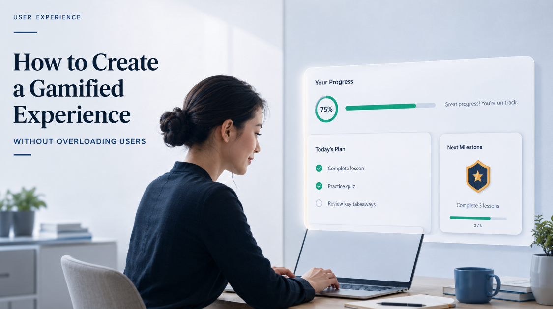
Better mechanics are usually more restrained. They help users move forward without turning the product into an arcade lobby.
A good onboarding progress bar tells users they are almost done. A good checklist makes a complicated setup feel less messy. A good streak system includes recovery options, because real people miss days. A good badge marks something meaningful, like completing a course, reaching a savings goal, or mastering a feature. A good challenge is tied to the user’s own goal, not some random growth metric the company wants to push.
Personal progress often beats public ranking. This is especially true for beginners. A leaderboard can motivate people who already feel confident, but it can discourage everyone else. Imagine joining a language app and immediately seeing that other users are thousands of points ahead. That does not feel inspiring. It feels like arriving late to a race you did not know you entered.
Instead of ranking users against strangers, show them their own improvement. “You completed 4 lessons this week” is calmer and more useful than “You are 842nd in your region.” Personal bests, weekly summaries, and skill-level progress can create motivation without turning every user into a contestant.
Control matters too. Gamification should not trap people. Let users mute reminders, pause streak pressure, skip celebrations, or choose a simpler interface. Some people like playful nudges. Others want the product to stay out of the way. Both groups are valid. A good experience does not assume everyone wants to be cheered at.
Tone is another place where products get weird. The mechanic may be fine, but the language ruins it. “You’re on track” is often stronger than “Amazing work, legend!” The right voice depends on the product, the audience, and the task. A meditation app can sound warm. A running app can sound energetic. A tax app should probably not throw confetti after someone uploads a document.
The best gamified copy sounds specific. Not “You’re awesome!” but “You completed 3 of 5 setup steps.” Not “Keep going!” but “One more section and your profile is ready.” Not “Claim your epic reward!” but “You unlocked the advanced lesson.” Specific feedback respects the user. Empty excitement talks down to them.
Before adding any gamified mechanic, teams should ask a few blunt questions:
- What user problem does this solve?
- What behavior should it support?
- Will users understand it without an explanation?
- Does it make the task easier, clearer, or more satisfying?
- Could it create pressure, shame, distraction, or confusion?
- Would the product still make sense without it?
- Are we adding this for the user, or for our dashboard?
That last question is uncomfortable, which is why it is useful.
Testing should be just as practical. Do not launch five mechanics and then try to guess which one worked. Start with one. Put it in front of real users. Watch what happens. Do they notice it? Do they understand it? Do they ignore it? Do they complete the task faster? Do they smile, hesitate, or look annoyed?
A realistic testing process can look like this:
- Choose one mechanic.
- Define the behavior it should improve.
- Test it with users before a full rollout.
- Compare completion rates, drop-off points, and return behavior.
- Ask users what felt helpful, distracting, childish, or stressful.
- Check whether the mechanic still works after the novelty fades.
- Remove it if it does not earn its place.
Quantitative data matters, but it does not tell the whole story. A/B tests can show whether completion improved. Session recordings can show where users hesitate. Surveys can catch emotional reactions. Support tickets can reveal confusion. Interviews can uncover the sentence nobody says in a dashboard: “I understand what this does, but I hate it.”
That emotional detail matters because gamification changes the feel of a product. It is not just a feature. It affects trust. A finance app that feels too playful may seem unserious. A learning app with no encouragement may feel dry. A health app that overuses streaks may make users feel guilty. The same mechanic can be helpful in one product and completely wrong in another.
Good gamification is often almost invisible. It does not beg for attention. It gives users a little momentum at the right moment. It makes progress easier to see. It makes the next action feel less heavy. It respects the task, the context, and the user’s patience.
This is why restraint is not a lack of creativity. It is the work. A product does not need badges, levels, coins, quests, streaks, and leaderboards all fighting for space. One clear mechanic that helps users move forward is better than six mechanics trying to look engaging.
Gamification should feel like a handrail, not a carnival. It should help people continue, understand where they are, and feel a bit more capable than they did a minute ago. If users remember the badge more than the value they came for, the design has probably lost the plot.